
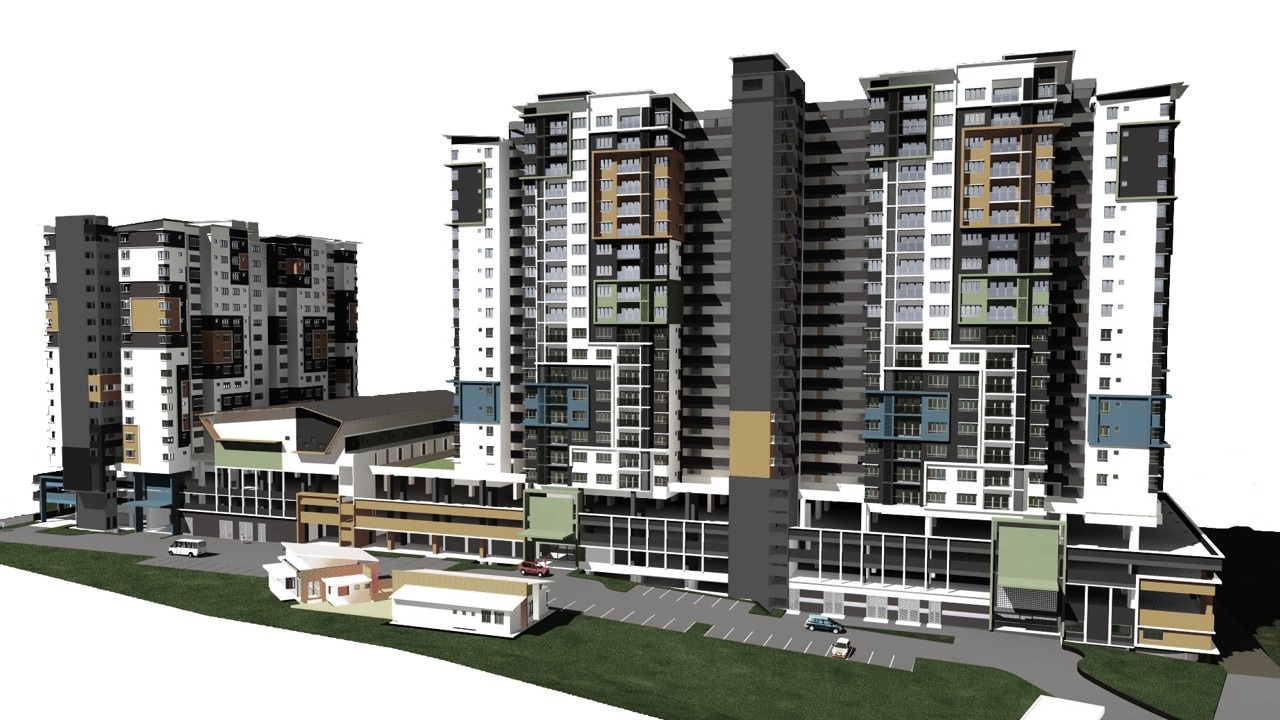
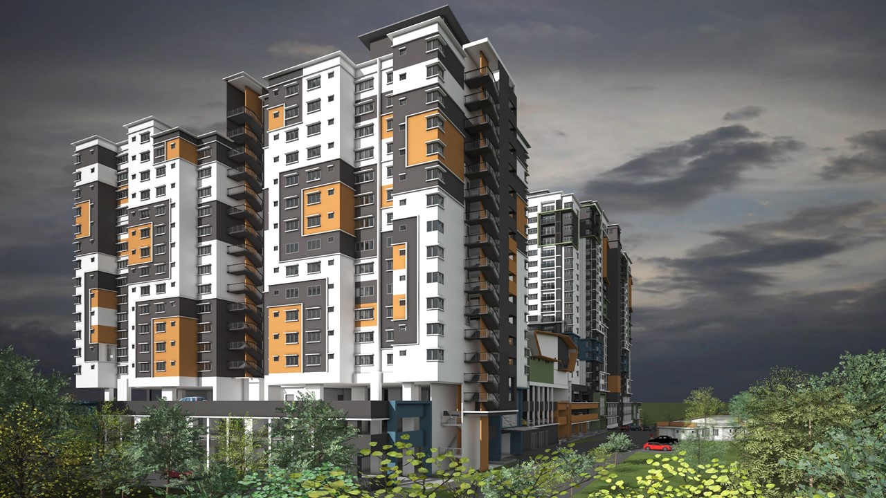
VERTIGO RESIDENCY
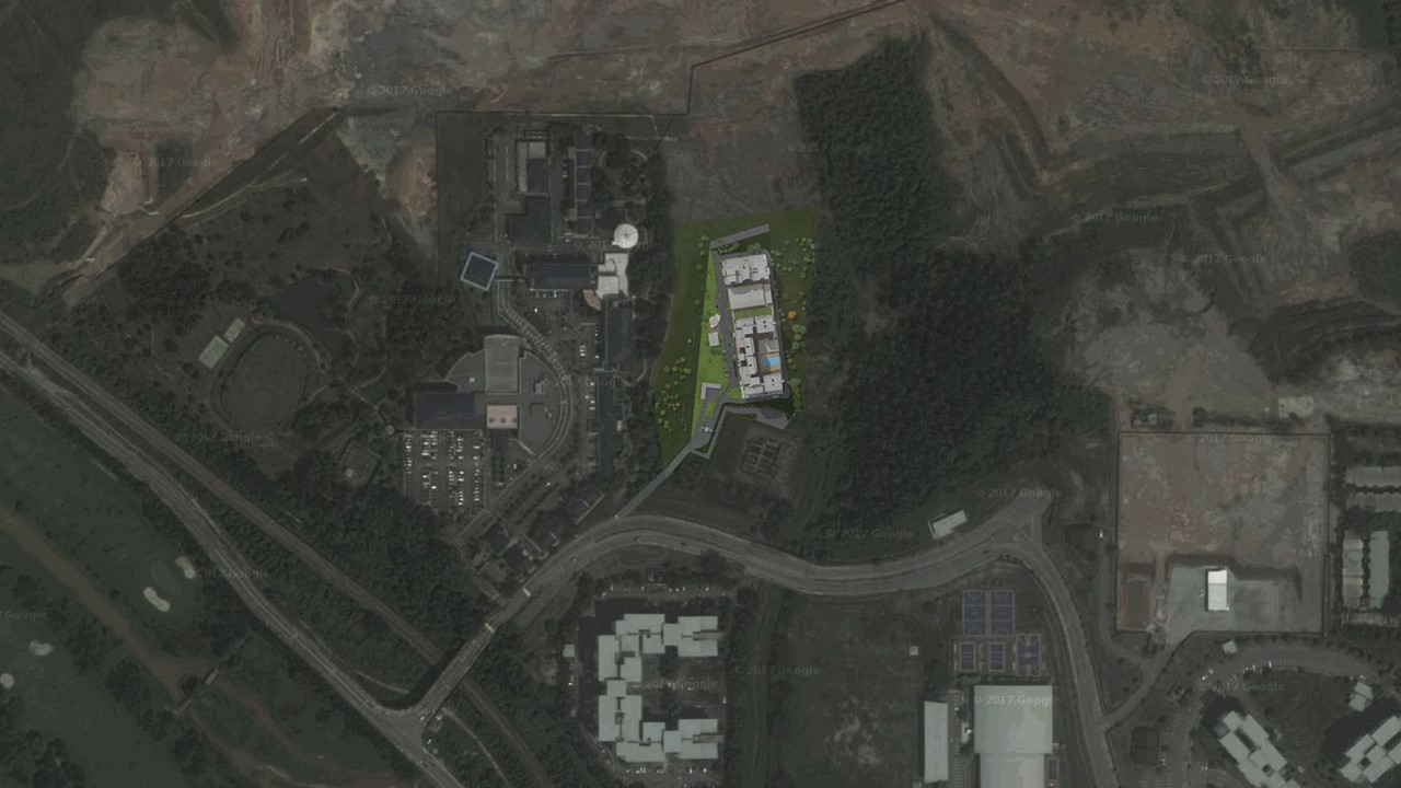
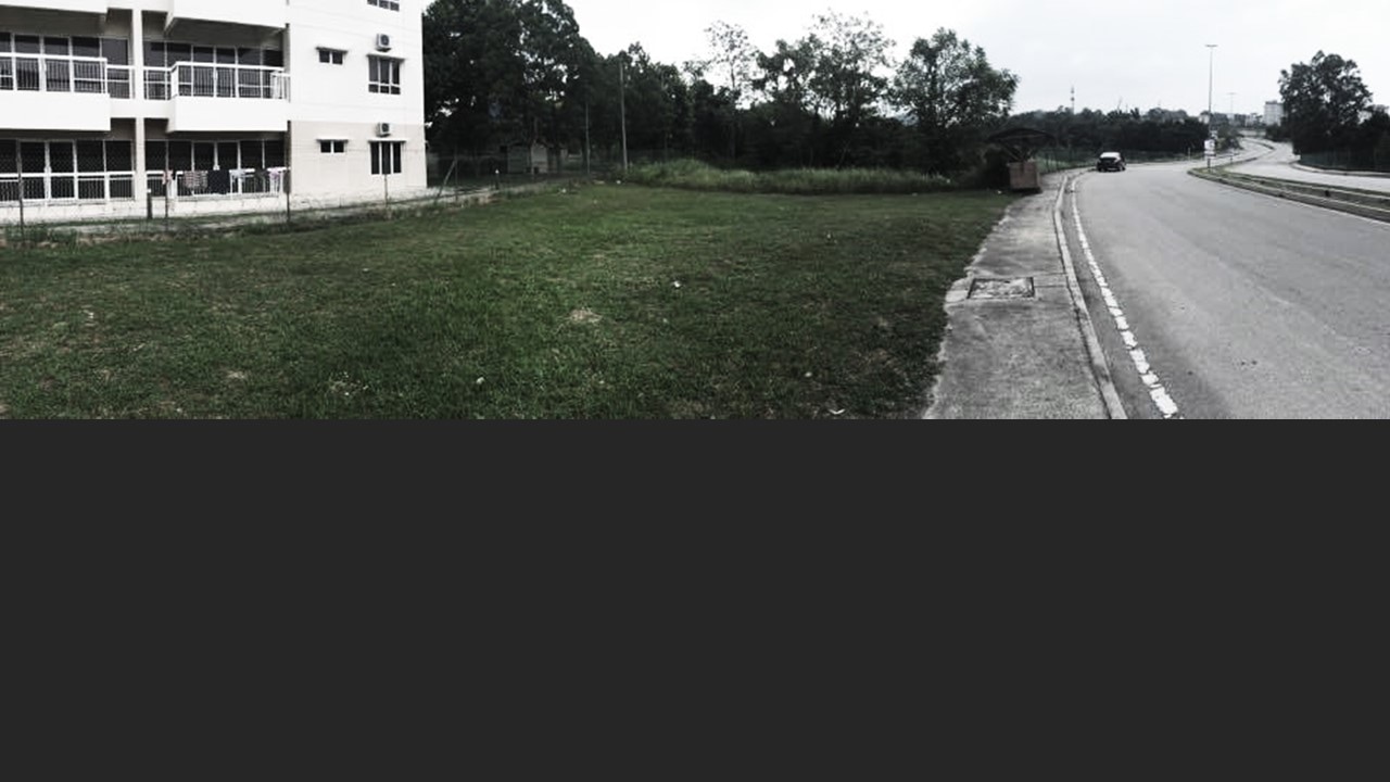
A Housing Development earmarked in a green enclave. Vertigo - means vertical. As reflected in the the site aerial view, the other side has undergone massive earthworks ready for another form of major development within the neighborhood. In this attempt, we tried to explore 2 major components. One being the so called low cost apartments while the other the mid cost apartment. In both attempts, we tried to improved on the floor layout and the internal layout of the units to bring back some form of dignity to the common average stratified user. Again, this is not a high-end expansive product but a sensible design attempt to house the masses.
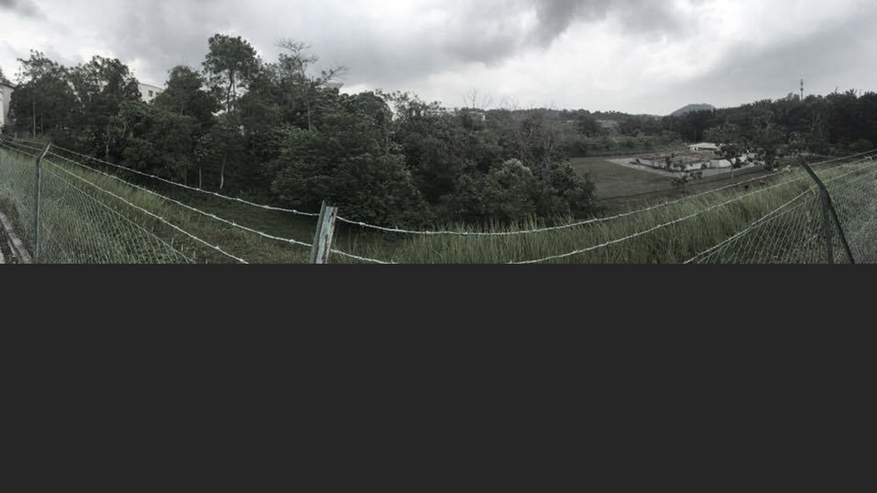
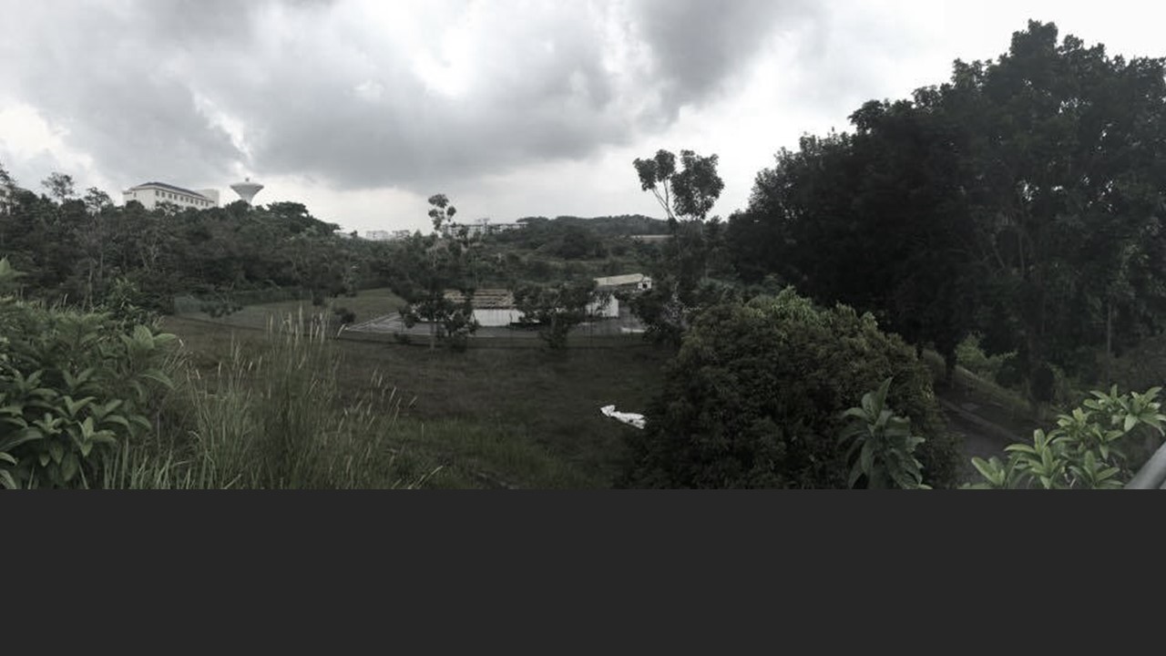
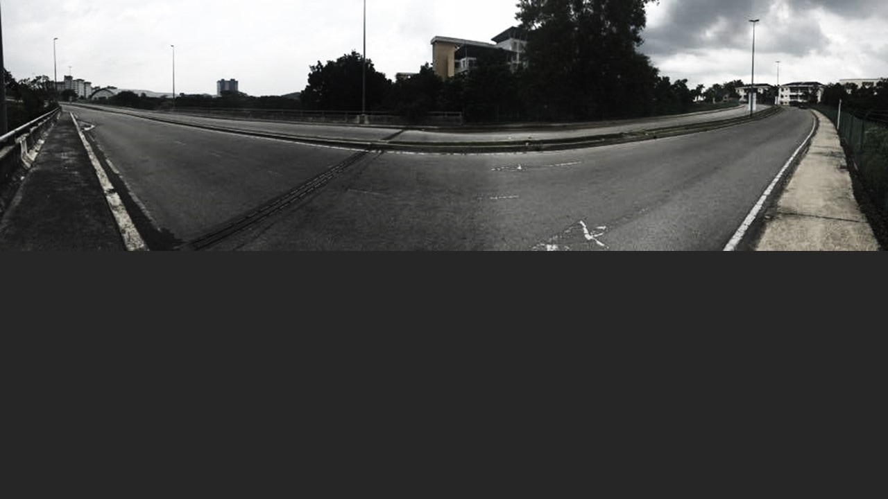
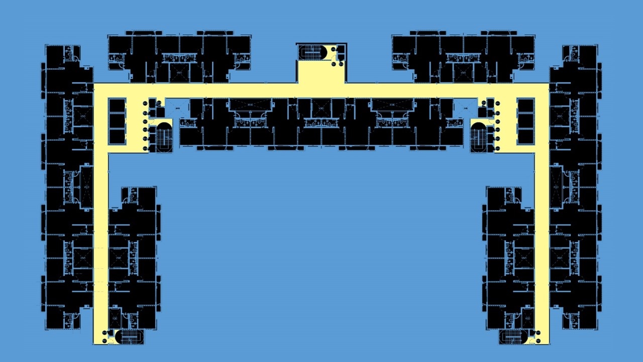
SITE
|
|
|
|
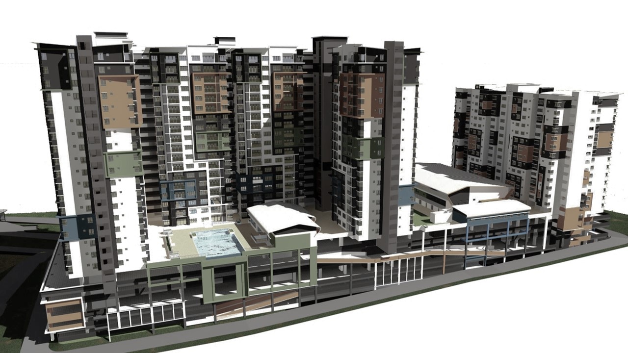
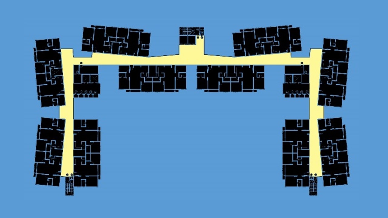
SCHEMATICS
Facade Treatment - We attempt to use RC hood to bring out the definition of the boxes as a technique to break up the otherwise huge and bulky elevations. The broken down masses are further refined with the introduction of color being darker grey as the background to further highlight the primary pastel of Orange, Green and Blue as the foreground. The White remains as the canvas that unified the entire composition. All the inner structure such as corridors and cores are in darker grey as to allow the Units to be outstanding in White.
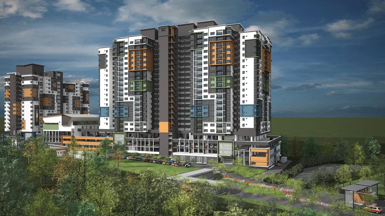

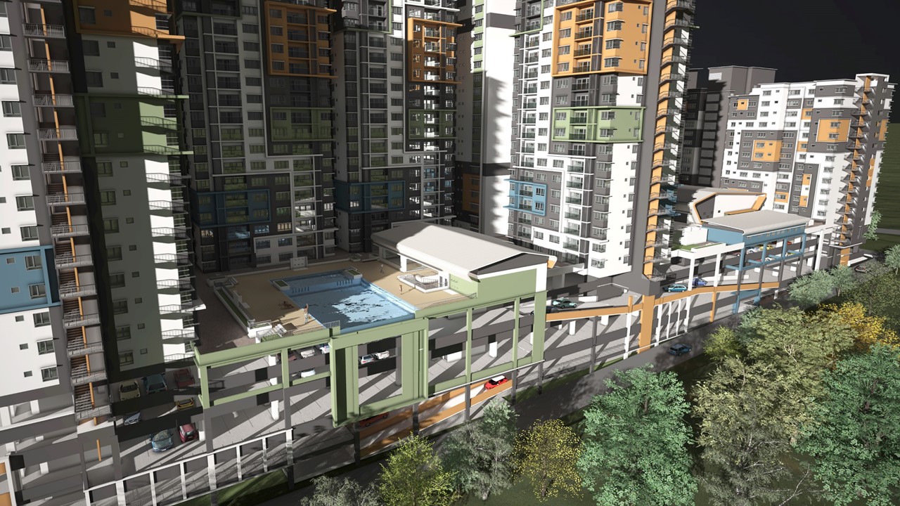
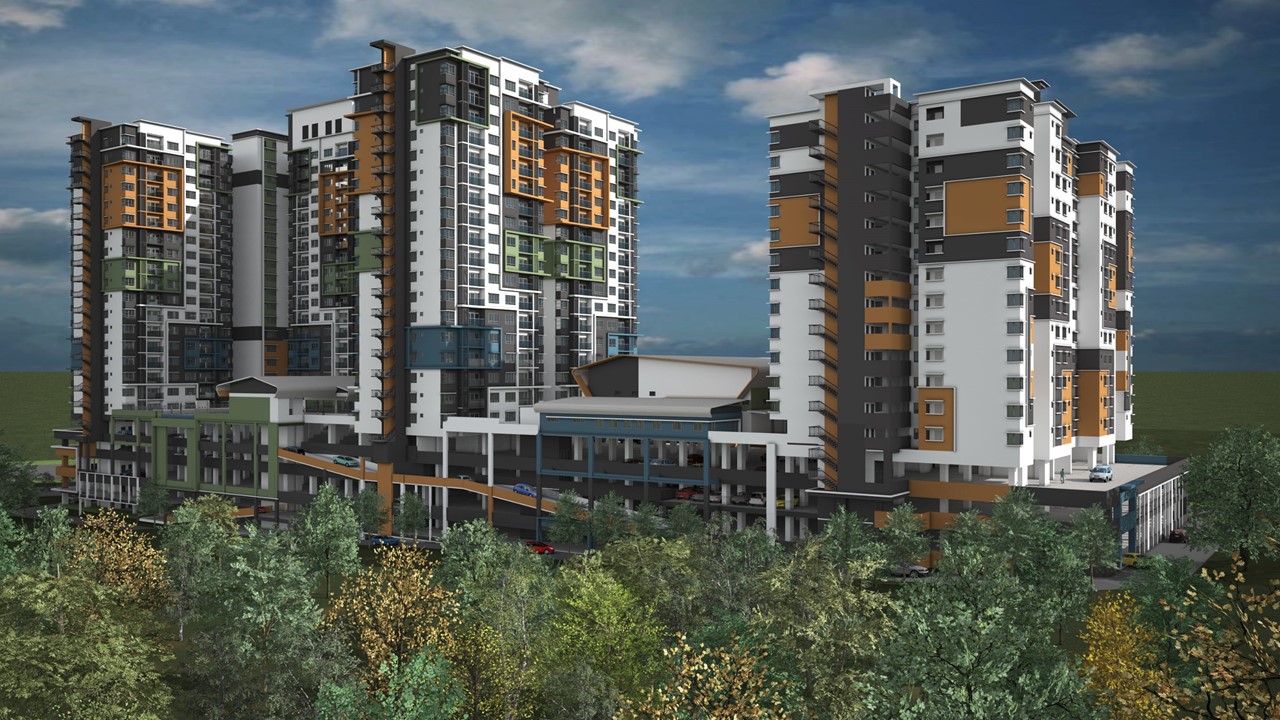
CONCEPTS
SMALL PROJECT
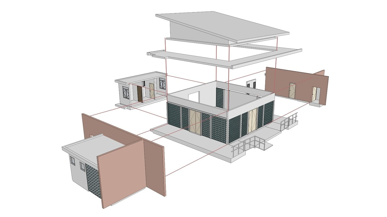
THE SURAU
We take pride to do some small project with the design of the Surau. The center core of the Prayer Hall is designed with Vent Blocks primary as the facade to allow maximum air flows drawing in from the narrow corridors. The walls in raw bricks shall be the funnels of air through the corridor into the prayer hall. The rest of the components such as the toilets for the male and the female will be attached. The single pitch roof shall be its top enclosure. This shall be the smallest environmental friendly Surau.
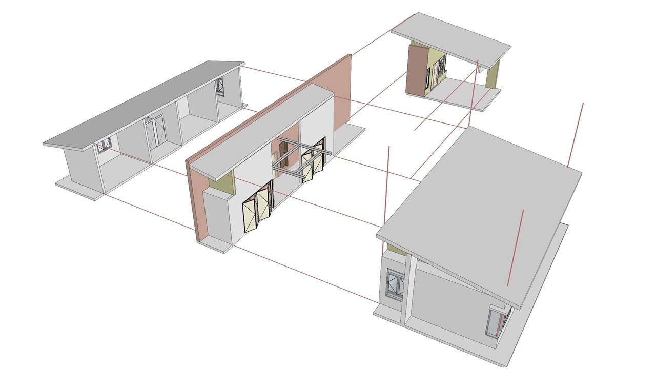
THE KIDERGARTEN
This kindergarten with its work based activities rooms arranged around the center spine as the walkway attached to the porch. Collapsible doors were introduced so that spaces could be double or triple up as and when necessary to accommodate mutual and group activities among the kids.
THE LAYOUT (MID COST)
SEMI DEE IN THE AIR
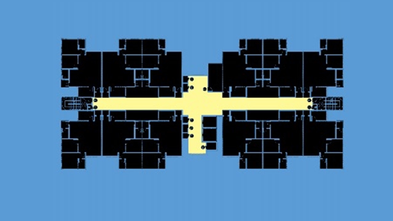
We have attempted to salvage an existing layout from being butchered to a form that are not very efficient in term of spatial configurations and organizations.
THE PRISON CRITIQUEBased on the old unit layout, with the same number per floor, you only ends up with dark double loaded corridors with very little cross ventilation - the very morphology of sick building syndrome.
|
THE SEMI DEE IN THE AIR CRITIQUEBased on the proposed unit layout, with the same number per floor, you gets ample single loaded corridors with plenty of cross ventilation. We even bring it a little further by slightly twisting the units to allow vent nooks so that wind would able to squeeze in between sets vertical planes thus ventilating the corridor. Paired arrangement allow what is marketed as semi Dee in the air - value for money....
|
THE UNIT (LOW COST)
WHEN CHEAP MEANS LESS QUALITY OF LIFE?
It is a very great challenge to design so called affordable housing. The notion of cheap housing equal less quality of life is a stigma among designers and architects because at one hand developers would not willing to spend additional cost and architects hands are tight to propose an innovative solutions. Yet, through years of research into such low cost typologies, we ought not to reinvent the wheel but to used what is known as time tested solutions...
THE LESS QUALITY OF LIFE CRITIQUEIn this model, you have 11 units per floor - quite a strange numbers per unit making construction less optimal. Although all the bedrooms are aligned to one side, you will noticed that the configurations of the kitchen and yard were less optimal this it is known as - loss in space. The balcony only adds up to the GFA with very little contribution to the quality of the Living area.
|
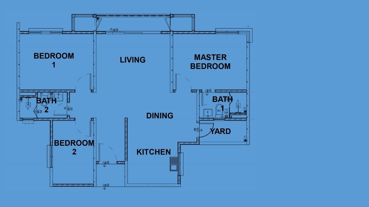
THE OPTIMAL MODEL CRITIQUEIn this model, we have 12 units per floor thus reducing 1 entire floor to the overall building height and save additional costs. The kitchen and yards are squeezed in between the 3rd bedroom with the 2nd bedroom. The kitchen proper is free to take up spaces in between the dining and foyer. Now with the living, dining and kitchen alignment, space with seamless connections will look longer and wider without increase of GFA. By so doing the balcony becomes obsolete.
|
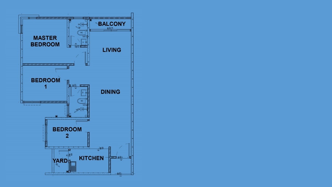
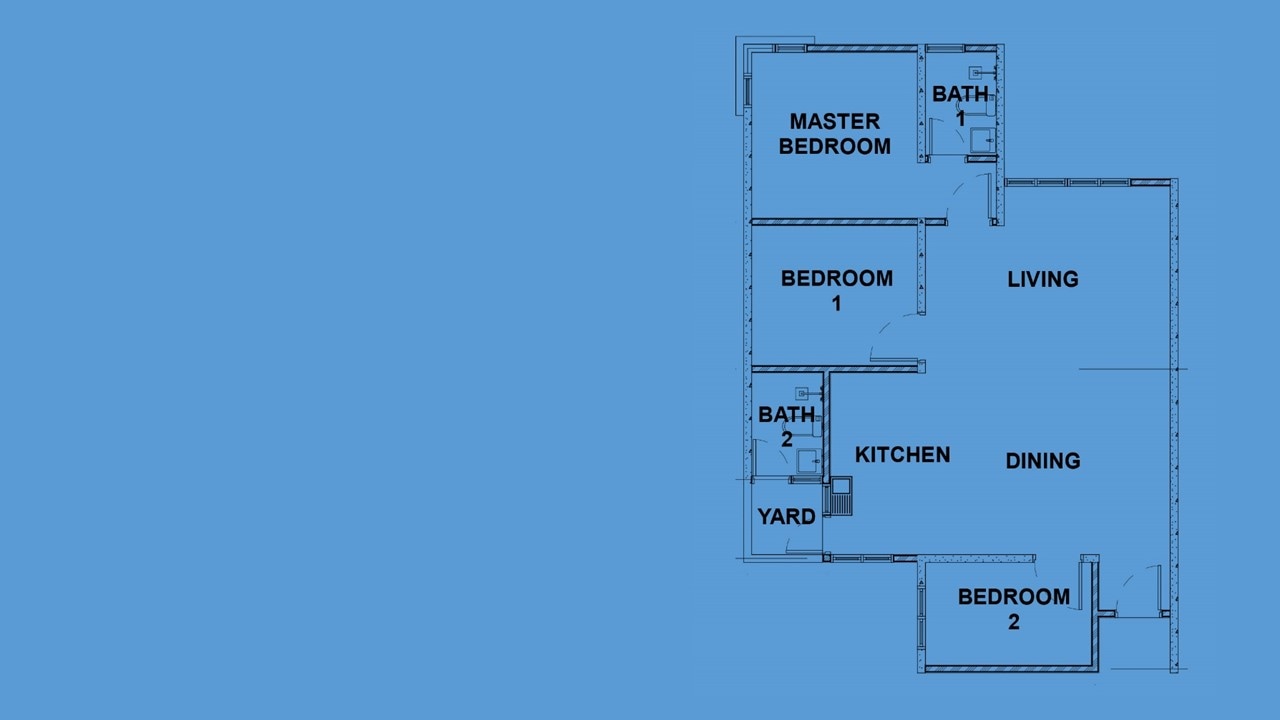
THE UNIT (MID COST)
THE ORIGINAL PLAN CRITIQUEThe entrance foyer had narrow tunnel vision usually imposed unnecessary obstacles for movement of larger furniture. Dining and Kitchen are squeezed together into a singular space almost suffocating. The yard is opening to the Dining without a sense of spatial sequence. Living Dining has been skewed instead of a continuous space. The width and length are much larger thus an absolute waste of space…
|
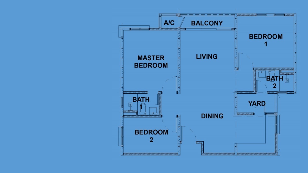
THE RIVISED PLAN CRITIQUEWe celebrated by opening up the foyer, linking a seamless connection space between the foyer, dining and living. We resembled a kitchen proper connecting to the yard and the toilet. Structurally aligned to allow for shear wall construction. This can never be a failed model – PERFECT!
|
